Typefaces Have Personalities Too?
Studies on typefaces within the past decade have identified unique personality traits with uncanny precision. Broadly speaking, serif types are more focused, organized and calm than sans serifs. Rounder types elicit happiness; sharper types elicit anger. Odd spacing can be interesting but aggressive; consistent spacing feels professional but boring. Some theorists argue that most typefaces fit into three distinct personality groups: elegant, friendly, and direct.
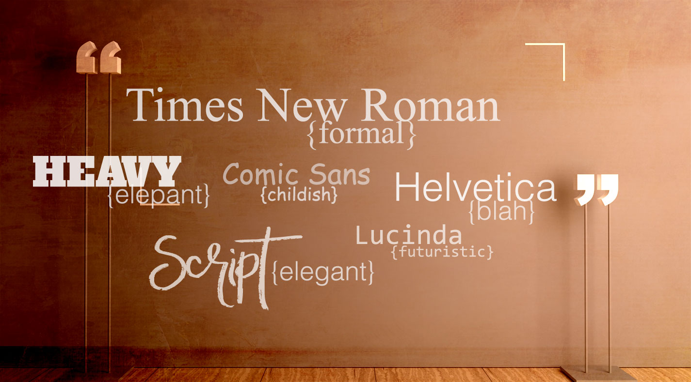
A recent study in which 63 students rated 15 common typefaces remains one of the most detailed personality profiles on record. Times New Roman emerged as the most professional and formal typeface (although people also labeled it “common”). New Courier was considered to be the least friendly. Helvetica (“very blah” with “no excitement”) was the least dramatic of all. Script typefaces took home the title of “most elegant”. Lucida Console felt most futuristic by virtue of odd spacing. Comic Sans rated as the least formal type; it was “too childish.”
People also tend to have an innate sense of when a type fits a situation. Participants taking speed identification tests respond faster when a font is paired with an matching description (the word “heavy” in a bulky font) than when there’s a mismatch (the word “heavy” in an airy font). Those reaction times hold true for metaphorical descriptions – replacing “heavy” with “elephant,” for instance. In a 2003 study, participants rated a friendly font (such as Bauhaus) as most appropriate for a friendly magazine piece, without knowing that the typeface had been pre-tested for friendliness.
Identifying the proper type for a situation can of course have huge implications for brand designers. The most direct evidence for this impact offered test participants two identical boxes of chocolate truffles named Temptation or Indulgence. Sometimes the names appeared in Signet Roundhand, an ornate script type; sometimes they appeared in Salem, an aggressive bold type. Thirty of 40 participants chose a box in Signet, whatever its name – a sign that when brand names are equal, a fitting font may prove to be the decisive factor pushing a customer to buy or not to buy.
That’s not to say there’s a perfect font for every situation. Many types are versatile (hello, Georgia); others are too similar for most eyes to distinguish (yes you, Times and Times New Roman); some are clearly meant for display rather than reading. And the power of typeface personality is limited in scope. The right font might make a satirical text more satirical, for instance, but the words themselves still matter.