

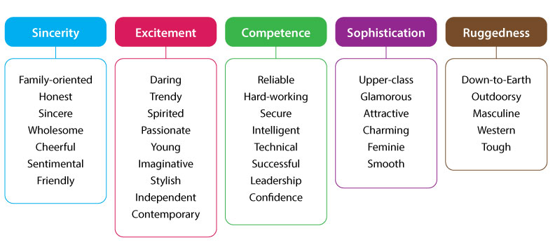
Branding Wisdom with 5 Dimensions of Color
Brands can sometimes cross between two traits, but they are mostly dominated by one. While certain colors do broadly align with specific traits (e.g., brown with ruggedness, purple with sophistication, and red with excitement), nearly every academic study on colors and branding will tell you that it’s far more important for colors to support the personality you want to portray instead of trying to align with stereotypical color associations.
Consider the inaccuracy of making broad statements such as “green means calm.” The context is absent: sometimes green is used to brand environmental issues, like the environmentally-friendly brand Seventh Generation, but other times it’s meant to brand financial spaces, such as Mint with its fresh bright yellow-green palette.
While brown may be useful for a rugged appeal, when positioned in another context, brown can be also used to create a warm, inviting feeling or to stir your appetite (every chocolate commercial you’ve ever seen).
Bottom line: There are no clear-cut guidelines for choosing your brand’s colors. “It depends” is a frustrating answer, but it’s the truth. However, the context you’re working within is an essential consideration. It’s the feeling, mood, and image that your brand or product creates that matters.
Color trends for men and women
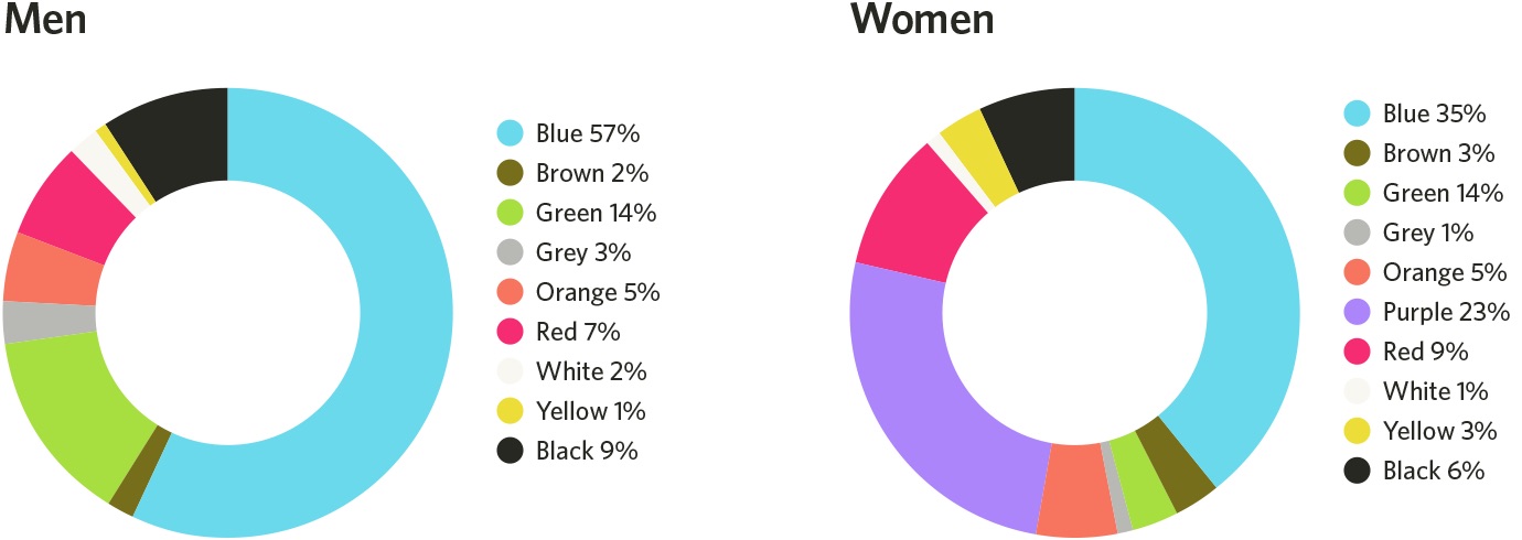
One of the more interesting examinations of this topic is Joe Hallock’s work on “Colour Assignment.” Hallock’s data showcases some clear preferences in certain colors across gender (most of his respondents were from Western societies). The most notable points in his images are the supremacy of blue across both genders and the disparity between groups on purple.
It’s important to note that one’s environment — and especially cultural perception — plays a strong role in dictating color appropriateness for gender, which in turn can influence individual choices.
Favorite colors of men and women:
Colors most disliked between men and women:
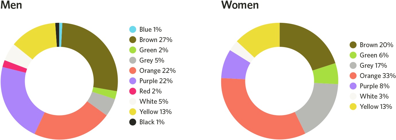
Additional research in studies on color perception and color preferences show that when it comes to shades, tints, and hues, men generally prefer bold colors while women prefer softer colors. Also, men were more likely to select shades of colors as their favorites (colors with black added), whereas women are more receptive to tints of colors (colors with white added).
Brands can easily work outside of gender stereotypes — in fact, I’d argue many have been rewarded for doing so because they break expectations.